
![]() At HumanGeo, we’re fans of Leaflet, Cloudmade’s JavaScript web mapping framework. In the past, we’ve used other JavaScript mapping frameworks like OpenLayers and Google Maps, and while these frameworks are great, we like Leaflet for its smooth animation, simple API, and good documentation and examples. In fact, we like Leaflet so much, we’ve been using it in all of our web projects that require a mapping component. Since Leaflet is a relative newcomer in the world of JavaScript mapping frameworks (2011), and since the developers have focused on keeping the library lightweight, there are plenty of opportunities to extend the basic functionality that Leaflet offers.
At HumanGeo, we’re fans of Leaflet, Cloudmade’s JavaScript web mapping framework. In the past, we’ve used other JavaScript mapping frameworks like OpenLayers and Google Maps, and while these frameworks are great, we like Leaflet for its smooth animation, simple API, and good documentation and examples. In fact, we like Leaflet so much, we’ve been using it in all of our web projects that require a mapping component. Since Leaflet is a relative newcomer in the world of JavaScript mapping frameworks (2011), and since the developers have focused on keeping the library lightweight, there are plenty of opportunities to extend the basic functionality that Leaflet offers.
As a side project at HumanGeo, we’ve been working on extending Leaflet’s capabilities to better support visualizing data, and these efforts have produced HumanGeo’s Leaflet Data Visualization Framework. Before I delve into some of the features of the framework, I’d like to provide a little background on why we created the framework in the first place, in particular, I’d like to focus on the challenges that developers face when creating data-driven geospatial visualizations.
When visualizing data on a 2D map we often wish to illustrate differences in data values geographically by varying point, line, and polygon styles (color, fill color, line weight, opacity, etc.) dynamically based on the values of those data. The goal is for users to look at our map and quickly understand geographic differences in the data being visualized. This technique is commonly referred to as thematic mapping, and is a frequently employed technique used in infographics and for illustrating concepts related to human geography. Within the realm of thematic mapping, proportional symbols and choropleth maps are two widely used approaches for illustrating variations in data.
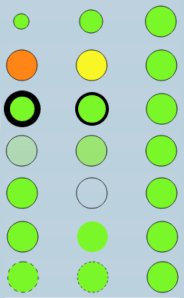
The proportional symbol approach highlights variations in data values at point locations using symbols sized proportionally to a given data value. In addition to varying symbol size, we can also vary symbol color or other style properties in order to highlight multiple data properties at each point. The image on the right shows some of the available style properties that we can vary for circle markers in Leaflet.
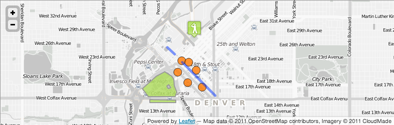
A good example of this approach is the USGS Earthquake Map, which by default shows earthquakes of magnitude 2.5 or greater occurring in the past week. This map denotes earthquakes using circles that are sized by magnitude and colored by age (white – older to yellow – past week to red – past hour). In an upcoming blog post, I’ll describe how we can use the Leaflet Data Visualization Framework along with USGS’ real-time earthquakes web service to easily reproduce this map.

Choropleth mapping involves styling polygons – typically country, state, or other administrative/political boundaries – based on statistical data associated with each polygon. In US election years, we see tons of maps and infographics showing breakdowns of voter preferences and predicted winners/losers by state, county, or other US political boundary. Infographics are becoming more and more popular, and there’s no shortage of news outlets like the New York Times, The Washington Post, and others producing maps illustrating various statistics at a range of administrative boundary levels. On the web, these choropleth maps are often custom developed, static or potentially interactive, single purpose maps that typically make use of a variety of frameworks, including more advanced all-purpose visualization frameworks like D3 rather than web mapping frameworks like Leaflet. This single purpose approach is not a problem when you’re using the map to show only one thing, but what if you want to show multiple data views or a variety of data on the same map? Nothing against D3 (which is awesome) or other general purpose visualization frameworks, but why would I want to learn the intricacies of some other framework in order to produce a choropleth map? If I’m already using Leaflet for all of my web mapping activities, why wouldn’t I use it for creating thematic maps?
Fortunately, Leaflet provides a number of built-in capabilities that enable creating thematic maps, including excellent support for GeoJSON and the ability to draw points using image-based, HTML-based, and circle markers as well as support for drawing lines and polygons and styling those features dynamically. There are a few tutorials on the Leaflet website that explain how to use Leaflet’s GeoJSON capabilities for displaying point, line, and polygon data and creating choropleth maps. I recommend checking these tutorials out if you’re interested in using Leaflet or want to better understand what capabilities Leaflet provides out of the box (screenshots of these tutorials plus links to the tutorials appear below).

While Leaflet’s out of the box capabilities simplify thematic map creation, there are still several challenges that developers face when trying to create thematic maps using Leaflet or any web mapping framework for that matter, particularly when GeoJSON data is not available. The first challenge is a common one for developers – no standard format. The Internet is full of data that can be used to build thematic maps, but this data comes in a variety of formats (CSV, TSV, XML, JSON, GeoJSON, etc.). This makes building reusable code that works with and across most datasets challenging. The underlying issue here, and perhaps the main reason that data is and will continue to be created in a variety of formats, is that the people creating this data aren’t typically creating the data with geospatial visualization in mind, so there will almost always be some aspect of massaging the data so that it can be loaded and displayed using the desired mapping framework.
Mapping data on a political/admin boundary level comes with its own set of challenges. Often the data driving choropleth and thematic map visualizations related to political boundaries are numbers and categories associated with a code for a given boundary. These codes can include (among other options): two digit state code, Federal Information Processing Standard (FIPS) code, International Organization for Standardization (ISO) two or three digit country code, state name, country name, etc. This again comes back to the issue of a lack of standardization; for country level statistics, for instance, you might see country name, two digit, three digit, numeric codes, or other codes being used across data providers. Very rarely are the geometries associated with each boundary included in the source data, and even more rare is pre-packaged GeoJSON that contains boundary polygons along with statistics as properties of each polygon. This introduces a challenge for developers in that we must find and associate boundary polygons with those boundary identifiers on the client-side or on the server in order to build a thematic map. On the client side, this may involve interacting with a web service (e.g. an OGC Web Feature Service (WFS)) that serves up those polygons, particularly in the case where we’re creating choropleth maps for lower level admin/political boundaries. In general, the two most common types of choropleth maps that people tend to create are country and state level maps. If I’m building a state or country choropleth, I’m probably going to be using all of the state or country polygons that are available, so making requests to a web service to get each polygon might be a little excessive. In addition, if we’re trying to display symbols based on state or country codes, we need the centroids of each political boundary in order to position each symbol correctly. This requires the need to calculate the centroid dynamically or to include it as a property of the boundary polygon.
In addition to challenges with data formats, there are often redundant tasks that developers must perform when creating thematic maps. These include:
- Retrieving data from a local/remote web server and translating those data into JavaScript objects
- Translating data locations into web mapping framework appropriate point/layer objects
- Dynamically styling point/layer objects based on some combination of data properties
- Setting up interactive features – handling mouseover and click events
- Displaying a legend to make it easier for the user to understand what’s being shown
In the grand scheme of things, these are not monumental challenges, but they do make the jobs of developers more difficult. HumanGeo’s Leaflet Data Visualization Framework helps to alleviate some of these challenges by abstracting many of these details from the developer. In particular, the framework seeks to:
- Enable cool, interactive, infographic style visualizations
- Support displaying data in any JSON-based data format (not just GeoJSON)
- Eliminate redundant code/tasks related to displaying data
- Provide tools for simplifying mapping one value to another (e.g. temperature to radius, count to color, etc.)
- Standardize the way in which data are loaded/displayed
- Minimize dependency on server-side components for typical use cases (e.g. visualizing data by US state or country)
- Remain consistent with Leaflet’s API/coding style so that it’s easy to pickup and use if you’re already familiar with Leaflet
It wouldn’t be a proper introduction to a framework that’s all about visuals without showing you some sample visualizations, so here are a few example maps created using the framework to give you an idea of the type of maps you can create:


In the next few blog entries, I’ll provide more details and examples illustrating how HumanGeo’s Leaflet Data Visualization Framework simplifies geospatial data visualization and thematic map creation. In the meantime, check out the code and examples on GitHub, and send me an e-mail if you’re interested, have questions, or want to contribute.

Beautiful maps!
excellent work! Plan to implement some maps with symbols soon.
Can we have a text inside the marker?