Tag Archives: Data Visualization

Building the HumanGeo Website Map

HumanGeo is a relatively new company – the founding date is a little bit fuzzy, but 4 years old seems to be the prevailing notion.  Our website hadn’t changed much in three plus years, and it was looking a little bit dated, even by three year old website standards, so last year we decided to take the plunge and update it.

Screen Shot 2015-06-22 at 7.08.36 AM
Here’s an Internet Archive snapshot of the old site, complete with shadowy HumanGeo guy (emphasis on the “Human” in HumanGeo, perhaps?)

It’s not that the old site was bad, it just wasn’t exciting, and it didn’t seem to capture all the things that make HumanGeo unique – it just sort of blended in with every other corporate website out there.  In building the new website, we set out to create an experience that is a little less corporate and a little more creative, with a renewed focus on concisely conveying what it is we actually do here.  Distilling all of the things we do across projects into a cohesive, clear message was a challenge on par with building the website itself, but I’ll save that discussion for another time.   Since HumanGeo is a young company that operates primarily in the services space, our corporate identity, while centered on a few core themes, is constantly evolving – very much driven by the needs of our partners and the solutions we collectively build.  One of the core themes that has remained despite the subtle changes in our identity over time is our focus on building geospatial solutions.  It’s the “Geo” in HumanGeo; this is precisely why we chose to display a map as the hero image on our main page (sorry HumanGeo guy).  This article is all about building that map, which is less a static image and more a dynamic intro into HumanGeo’s world.  My goal with this article is to highlight the complexity that went into building the map and some of the ways in which the Leaflet DVF and a few other libraries (Stamen, TopoJSON, Parallax JS) simplified development or added something special.

The HumanGeo Website Map

When you arrive at our site, you’re greeted with a large Leaflet JS-based map with a Stamen watercolor background and some cool parallax effects (at least I think it’s cool).  It’s more artsy than realistic (using the Stamen watercolor map tiles pretty much forced our hand stylistically), an attempt to emphasize our creative and imaginative side while still highlighting the fact that geospatial is a big part of many of the solutions that we build.  The map is centered on DC with HumanGeo’s office in Arlington in the lower-left and some pie charts and colored markers in the DC area. The idea here is that you’re looking at our world from above, and it’s sort of a snapshot in time.  At any given point in time there are lots of data points being generated from a variety of sources (e.g. people using social media, sensors, etc.), and HumanGeo is focused on helping our partners capture, analyze and make sense of those data points.  As you move your mouse  over the map or tilt your device, the clouds, satellite, plane, and map all move – simulating the effect of changing perspective that you might see if you were holding the world in your hands.  In general, I wanted this area (the typical hero image/area) to be more than just a large static stock image that you might see on many sites across the web – I wanted it to be dynamic.  If you spend any time browsing our site, you’ll see that this dynamic hero area is a common element across the pages of our site.

Parallax

Parallax scrolling is popular these days, making its way into pretty much every slick, out of the box website template out there.  Usually you see it in the form of a background image that scrolls at a different speed than the main text on a page.  It gives the page dimension, as if the page is composed of different layers in three dimensional space.  In general, I’m a fan of this effect.  However, I decided to go with a different approach for this redesign – mainly because I saw a cool library that applied parallax effects based on mouse or device movement rather than scrolling, and the thought of combining it with a map intrigued me.  The library I’m referring to is Parallax JS, a great library that makes these type of effects easy.  To create a parallax scene, you simply add an unordered list (ul) element – representing a scene – to the body of your page along with a set of child list item (li) elements that represent the different layers in the scene.  Each li element includes a data-depth attribute that ranges from 0.0 to 1.0 and specifies how close to or far away from the viewer that layer will appear (closeness implies that the movement will be more exaggerated).  A value of 0.0 indicates that the layer will be lowest in the list and won’t move, while a value of 1.0 means that the layer will move the most.   In this case, my scene is composed of the map as the first li element with various layers stacked on top of it including the satellite imaging boxes, the satellite, the clouds, and the plane.  The map has a data-depth value of 0.05, which means it will move a little, and each layer over top of the map has an increasing data-depth value.  Here’s what the markup looks like:


<ul id="scene">
<li class="layer maplayer" data-depth="0.05">
 <div id="map"></div>
</li>
<li class="layer imaginglayer" data-depth="0.30">
 <div style="opacity:0.2; top: 190px; left: 1100px; width: 400px; height: 100px;" />
</li>
<li class="layer imaginglayer" data-depth="0.40">
 <div style="opacity:0.3; top: 180px; left: 1150px; width: 300px; height: 75px;" />
</li>
<li class="layer imaginglayer" data-depth="0.50">
 <div style="opacity:0.4; top: 170px; left: 1200px; width: 200px; height: 50px;" />
</li>
<li class="layer imaginglayer" data-depth="0.60">
 <div style="opacity:0.5; top: 160px; left: 1250px; width: 100px; height: 25px;" />
</li>
<li class="layer cloudlayer" data-depth="0.60"></li>
<li class="layer planelayer" data-depth="0.90"></li>
<li class="layer satellitelayer" data-depth="0.95">
 <img src="images/satellite.png" style="width: 200px; height: 200px; top: 20px; left: 1200px;">
</li>
</ul>

A Moving Plane

On modern browsers, the plane moves via CSS 3 animations, defined using keyframes.  Keyframes establish properties that will be applied to the HTML element being animated at different points in the animation.  In this case, the plane will move in a linear path from 0,  800 to 250, -350 through the duration of the animation.


@keyframes plane1 {

     0% {
          top: 800px;
          left: 0px;
     }

     100% {
          top: -350px;
          left: 250px;
     }

}

@-webkit-keyframes plane1 {

     0% {
          top: 800px;
          left: 0px;
     }

     100% {
          top: -350px;
          left: 250px;
     }

}

@-moz-keyframes plane1 ...

@-ms-keyframes plane1 ...

#plane-1 {
     animation: plane1 30s linear infinite normal 0 running forwards;
     -webkit-animation: plane1 30s linear infinite normal 0 running forwards;
     -moz-animation: plane1 30s linear infinite normal 0 running forwards;
     -ms-animation: plane1 30s linear infinite normal 0 running forwards;
}

On to the Map

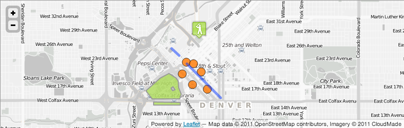
The map visualizations use a mix of real and simulated data.  Since we’re located in the DC area, I wanted to illustrate displaying geo statistics in DC, but first, I actually needed to find some statistics related to DC.  I came across DC’s Office of the City Administrator’s Data Catalog site that lists a number of statistical data resources related to DC.  Among those resources are Comma Separated Value (CSV) files of all crime incident locations for a given year, such as this file, which lists crime incidents for 2013.  The CSV file categorizes each incident by a number of attributes and administrative boundary categories, including DC voting precinct.  I decided to use DC voting precincts as the basis for displaying geo statistics, since this would nicely illustrate the use of lower level administrative boundaries, and there are enough DC voting precincts to make the map interesting versus using another administrative boundary level like the eight wards in DC.  I downloaded the shapefile of DC precincts from the DC Atlas website and then used QGIS to convert it to GeoJSON to make it easily parseable in JavaScript.  At this point, I ran into the first challenge.  The resulting GeoJSON file of DC precincts is 2.5 MB, which is obviously pretty big from the perspective of ensuring that the website loads quickly and isn’t a frustrating experience for end users.

To make this file useable, I decided to compress it using the TopoJSON library. TopoJSON is a clever way of compressing GeoJSON, invented by Mike Bostock of D3 and New York Times visualization fame.  TopoJSON compresses GeoJSON by eliminating redundant line segments shared between polygons (e.g. shared borders of voting precinct boundaries). Instead of each polygon in a GeoJSON file sharing redundant line segments, TopoJSON stores the representation of those shared line segments, and then each polygon that contains those segments references the shared segments. It does amazing things when you have GeoJSON of administrative boundaries where those boundaries often include shared borders. After downloading TopoJSON, I ran the script on my DC precincts GeoJSON file:

topojson '(path to GeoJSON file)' -o '(path to output TopoJSON file)' -p

Note that the -p parameter is important, as it tells the TopoJSON script to include GeoJSON feature properties in the output.  If you leave this parameter off, the resulting TopoJSON features won’t include properties that existed in the input GeoJSON.  In my case, I needed the voting_precinct property to exist, since the visualizations I was building relied on attaching statistics to voting precinct polygons, and those polygons are retrieved via the voting_precinct property.  Running the TopoJSON script yielded a 256 KB file, reducing the size of the input file by 90%!

It’s important to note that in rare cases using TopoJSON doesn’t make sense.  You’ll have to weigh the size of your GeoJSON versus including the TopoJSON library (a light 8 KB minified) and the additional processing required by the browser to read GeoJSON out of the input TopoJSON.  So, if you have a small GeoJSON file with a relatively small number of polygons, or the polygon features in that GeoJSON file don’t share borders, it might not make sense to compress it using TopoJSON.  If you’re building choropleth maps using more than a few administrative boundaries, though, it almost always makes sense.

Once you have TopoJSON, you’ll need to decode it into GeoJSON to make it useable.  In this case:


precincts = topojson.feature(precinctsTopo, precinctsTopo.objects.dcprecincts);

precinctsTopo is the JavaScript variable that references the TopoJSON version of the precinct polygons.  precinctsTopo.objects.dcprecincts is a GeoJSON GeometryCollection that contains each precinct polygon.  Calling the topojson.feature method will turn that input TopoJSON into GeoJSON.

Now that I had data and associated polygons, I decided to create a couple of visualizations.  The first visualization illustrates crimes in DC by voting precinct using a single L.DataLayer instance but provides different visuals based on the input precinct.  For some precincts, I decided to display pie charts sized by total crime, and for others I decided to draw a MarkerGroup of stacked CircleMarker instances sized and colored by crime.

Screen Shot 2014-09-18 at 7.20.11 PM

Screen Shot 2014-09-18 at 7.19.44 PM

The reason for doing this is that I wanted to illustrate two different capabilities that we provide our partners, event detection from social media and geo statistics.  Including these in the same DataLayer instance ensures that the statistical data only get parsed once.  For the event detection layer, I also wanted to spice it up a bit by adding an L.Graph instance that illustrates the propagation of an event in social media from its starting point to surrounding areas.  In this case, I generated some fake data that represent the movement of information between two precincts, where each record is an edge.  Here’s what the fake data look like:


var precinctConnections = [
 {
 'p1': 'Precinct 129',
 'p2': 'Precinct 127',
 'cnt': '120'
 },
 {
 'p1': 'Precinct 129',
 'p2': 'Precinct 142',
 'cnt': '5'
 },
 {
 'p1': 'Precinct 129',
 'p2': 'Precinct 128',
 'cnt': '89'
 },
 {
 'p1': 'Precinct 129',
 'p2': 'Precinct 2',
 'cnt': '65'
 },
 {
 'p1': 'Precinct 129',
 'p2': 'Precinct 1',
 'cnt': '220'
 },
 {
 'p1': 'Precinct 129',
 'p2': 'Precinct 90',
 'cnt': '28'
 },
 {
 'p1': 'Precinct 129',
 'p2': 'Precinct 130',
 'cnt': '180'
 },
 {
 'p1': 'Precinct 129',
 'p2': 'Precinct 89',
 'cnt': '150'
 },
 {
 'p1': 'Precinct 129',
 'p2': 'Precinct 131',
 'cnt': '300'
 }
];

Here’s the code for instantiating an L.Graph instance and adding it to the map.


var connectionsLayer = new L.Graph(precinctConnections, {
     recordsField: null,
     locationMode: L.LocationModes.LOOKUP,
     fromField: 'p1',
     toField: 'p2',
     codeField: null,
     locationLookup: precincts,
     locationIndexField: 'voting_precinct',
     locationTextField: 'voting_precinct',
     getEdge: L.Graph.EDGESTYLE.ARC,
     layerOptions: {
          fill: false,
          opacity: 0.8,
          weight: 0.5,
          fillOpacity: 1.0,
          distanceToHeight: new L.LinearFunction([0, 5], [5000, 1000]),
          color: '#777'
     },
     tooltipOptions: {
          iconSize: new L.Point(90,76),
          iconAnchor: new L.Point(-4,76)
     },
     displayOptions: {
          cnt: {
                displayName: 'Count',
                weight: new L.LinearFunction([0, 2], [300, 6]),
                opacity: new L.LinearFunction([0, 0.7], [300, 0.9])
          }
     }
});

map.addLayer(connectionsLayer);

The locations for nodes in the graph are specified via the precincts GeoJSON retrieved from the TopoJSON file I discussed earlier.  fromField and toField tell the L.Graph instance how to draw lines between nodes.

The pie charts include random slice values.  I could have used the actual data and broken down the crime in DC by type, but I wanted to keep the pie charts simple, and three slices seemed like a good number.  There are more than three crime types that were committed in DC in 2013.  As a bit of an aside, here’s a representation of crimes in DC color-coded by type  using L.StackedRegularPolygonMarker instances.

dccrimes

The code for this visualization can be found in the DVF examples here.  It’s more artistic than practical.  One of the nice features of the Leaflet DVF is the ability to easily swap visualizations by changing a few parameters – so in this example, I can easily swap between pie charts, bar charts, and other charts just by changing the class that’s used (e.g. L.PieChartDataLayer, L.BarChartDataLayer, etc.) and modifying some of the options.

After I decided what information I wanted to display using pie charts, I ventured over to the Color Brewer website and settled on some colors – the 3 class Accent color scheme in the qualitative section here – that work well together while fitting in with the pastel color scheme prevalent in the Stamen watercolor background tiles.  The Leaflet DVF has built in support for Color Brewer color schemes (using the L.ColorBrewer object), so if you see a color scheme you like on the Color Brewer website, it’s easy to apply it to the map visualization you’re building using the L.CustomColorFunction class, like so:

var colorFunction = new L.CustomColorFunction(1, 55, L.ColorBrewer.Qualitative.Accent['3'], {
 interpolate: false
});

I also wanted to highlight some of the work we’ve been doing related to mobility analysis, so I repurposed the running data from the Leaflet DVF Run Map example and styled the WeightedPolyline so that it fit in better with our Stamen watercolor map, using a white to purple color scheme.  The running data look like this:


var data={
 gpx: {
 wpt: [
 {
 lat: '38.90006',
 lon: '-77.05691',
 ele: '4.98652',
 name: 'Start'
 },
 {
 lat: '38.90082',
 lon: '-77.0572',
 ele: '4.9469',
 name: 'Run 001'
 },
 {
 lat: '38.90098',
 lon: '-77.05725',
 ele: '5.23951',
 name: 'Run 002'
 },
 ...
 {
 lat: '38.89517',
 lon: '-77.02822',
 ele: '4.74573',
 name: 'Run 109'
 }
 ]
 }
}

Check out the Run Map example to see how this data can be turned into a variable weighted line or the GPX Analyzer example that lets you drag and drop GPS Exchange Format (GPX) files (a common format for capturing GPS waypoint/trip data) onto the map to see variations in the speed of your run/bike/or other trip in space and time.

To make the map a little more interesting, I added some additional layers for our office, employees, and some boats in the water (the employee and boat locations are made up).  Now that I had the map layers I wanted to use, I incorporated them into a tour that allows a user to navigate the map like a PowerPoint presentation.  I built a simple tour class that has methods for navigating forward and backward.  Each tour action consists of an HTML element with some explanatory text and an associated function to execute when that action occurs.  In this case, the function to execute usually involves panning/zooming to a different layer on the map or showing/hiding map layers.  The details of the tour interaction go beyond collecting, transforming and visualizing geospatial data, so feel free to explore the code here and check out the tour for yourself by visiting our site and clicking on the HumanGeo logo.

We’re hiring!  If you’re interested in geospatial, big data, social media analytics, Amazon Web Services (AWS), visualization, and/or the latest UI and server technologies, drop us an e-mail at info@thehumangeo.com.

Beer Caps to Coffee Tables

Some years ago, I lived in Norfolk, VA with a friend who loved craft beer as much as I did. Our hoppy passion motivated us to brew beer at home, visit local craft beer stores, and generally enjoy our nights with a brew here or there. Subconsciously knowing it would be a brilliant idea, we used a tupperware box next to our refrigerator to house a growing collection of beer caps, feeding it a single cap as each beer departed the cold, destined for enjoyment.

After a few years, I realized the box was close to being filled to the brim. The mechanical gears in my head were cranking out an idea to do something creative with the bottle caps. I wanted to incorporate some things I’d learned in my classes related to imaging, computer vision, data mining, and spectral signatures. I also had an old square coffee table (36″x36″) that could be the canvas to this project. This was the beginning of a fun exploration in image processing with python to create a bottle cap magnum opus.

Getting it Done
There were a few things I needed to do; first, I needed more caps.  Given the size of a bottle cap (1″) minus some width for a border around the table and a little space between the caps, I found that the table would accept a 30 cap by 30 cap grid, therefore I needed at least 900 caps.  A local bar supported this effort by hosting a 5 gallon bucket for the bartender to drop caps into in lieu of the trash can.

Second, I needed a way to extract the data (color; specifically red, green, and blue) from each individual cap.  I originally arranged the images on a gridded sheet of paper, took a photo, and extracted them row-by-column after performing some image transforms to account for the skewed nature of the image.  As it turns out, there is no good way to get a completely top-down image of the caps; it will always turn out to be smaller at the top and larger at the bottom depending on the angle you held the camera at. The data wasn’t fantastic and as more caps came in, I knew I needed a better way; a quick survey of computer vision capabilities turned up a concept called a Hough Transform.

Hough transforms are a method of identifying shapes that can be approximated by equations in images; in this case, a circle with a roughly known radius was the target. This synopsis is a vast simplification, but for each pixel in the output image (of the same size as the input image), the algorithm polls those surrounding pixels that might form a circle and assigns a value to that pixel. Based on all the pixels in the image, one can then surmise that the pixels with values above a certain threshold are the center point for a circle of known radius. To facilitate the discovery of circles of a specific radius (as many caps have concentric circle patterns), I used a Sobel operator to convert the image into an edge-only image.

caps_on_sheet
A subset of the caps, spread out and photographed.

Although I initially wrote my own Sobel Filter and Hough Transform in Python, I think it’s smarter to use OpenCV, which I later discovered.  OpenCV is a set of computer vision related functions written in C/C++ with wrappers for Python; Hough transforms are only one of the things that OpenCV can simplify from a multi-hour debacle into a few minutes of digging in the documentation for the right tool. Here  is a quick snippet of something that took me dozens of lines of code in earlier editions:

def cv2hough(sobel_image, color_image, minrad, maxrad):
    '''
    Identifies and cuts out to a directory potentially circular
    shapes that match a known radius range.
    :param sobel_image: sobel-filtered image
    :param color_image: non-sobel filtered version of colored_image
    :return:
    '''
    in_cv_image = cv2.imread(sobel_image, 0)
    avg_rad = (minrad+maxrad)/2
    circles = cv2.HoughCircles(in_cv_image, cv.CV_HOUGH_GRADIENT, 1, 65,
    param1=90, param2=15,
    minRadius=minrad, maxRadius=maxrad)
    exportCircles(circles, color_image, 'caps', avg_rad)

(Documentation for cv2.HoughCircles)

This code snippet concludes by sending a list of all the places on the image where it thinks a cap might be to “exportCircles”, where those caps are then cut out of the image and sent to a 30px x 30px JPG file.

circle_3_img
A cap, post-extraction. It’s a rough approximation, but the hough transform was sufficient.

Once we have a directory containing hundreds and hundreds of caps, we can begin some analysis. (Full disclosure: I manually scrolled through the images and deleted those that appeared unusable.) Python was used to calculate statistics for each bottle cap image, and eventually stored the data in a structure. Each pixel is calculated applying a red (R), green (G), and blue (B) value. We can average these and get average (R,G,B) triplets for each bottle cap, that is to say; a cap is “mostly” red, or “mostly” blue, etc. I soon found that these numbers weren’t that descriptive and began to work in the Hue, Saturation, and Value color spaces. (HSL & HSV: Wikipedia).

Protip: I used a quick one-liner to convert from RGB to HSV before storing the data:
colorsys.rgb_to_hsv(rgb[0], rgb[1], rgb[2])

To save time cataloging 900 bottle caps and associated pixels, I pickle (serialize) each cap as I generate the data on it so I can quickly reference a data structure containing the caps and rearrange them as I see fit.

caps_avg
The caps by average, as the computer sees them.
comp_output
The caps as we see them; the final arrangement was sorted by hue then saturation.

Final Steps: Output
I originally wanted to see what it would look like when I rearranged the bottle caps into different patterns. This is where we do that, and based on the data we have and the framework we’ve built, outputting an image or a HTML document (this is a really hasty solution!) becomes fairly easy, minus one hiccup.

def first_sort(self):
    '''
    Reach into the internal config and find out what we want to have as
    our first order sort on the caps.
    :return:
    '''
    self.sortedDatList = sorted(self.imageDatList,
                                key=lambda thislist: thislist[
                                    self.sorts[self.conf['first_sort']]])
    del self.imageDatList
    self.imageDatList = self.sortedDatList

def second_sort(self):
    '''
    Second sort on the caps: sort rows individually.
    Example: We want a 30x30 grid of caps, sorted first by hue, then by
    saturation.
    We sort by hue in first_sort, then in second_sort, we sort 30 lists
    of 30 caps each individually and replace them into the list.
    :return:
    '''
    ranges = [[self.conf['out_caps_cols'] * (p - 1),
               self.conf['out_caps_cols'] * p] for p in
              range(1, self.conf['out_caps_rows'] + 1)]
    for r in ranges:
        self.imageDatList[r[0]:r[1]] = sorted(self.imageDatList[r[0]:r[1]],
                                              key=lambda thislist: thislist[
                                                  self.sorts[self.conf[
                                                      'second_sort']]])

Here we see two functions: firstSort and secondSort. You can guess that we sort the caps once, then sort them again; what may not be apparent from this code is that the second sort (which is performed on a different attribute), is performed based on the out_caps_rows attribute. This is the hiccup; you must sort multiple sub-segments of the array of bottle caps, in essence, sorting the rows after the columns have been generated. Otherwise each row of bottle caps will have a random pattern as the image trends from one extreme (top) to the other (bottom).

caps_organized
Caps, laid out and ready to be transferred to the table.

The Physical Construction
To finish the project, I physically arranged a pattern based on informal votes from friends and acquaintances. I built a 1/2″ lip around the table with “Quarter-Round” molding. I glued this down, sealed the seams with wood glue, and painted everything black.

I filled the bottom of this open-top area with playground sand. This minimized the volume that I would have to fill in with expensive epoxy resin. It had the secondary benefit of lightening up the entire display, knowing the epoxy would darken it. I ordered two kits of “AeroMarine 300/21 Epoxy Resin” (for a total of 3 Gallons) from the internet. Ultimately, I arranged the caps on a sheet of butcher’s paper and transferred them one-by-one to the sand box.

A few friends, the famous roommate, and I gathered (with beers); we mixed the resin and began the process of pouring the resin onto the table. The one unseen consequence of the sand was that when the epoxy entered the sand, it pushed air upwards, causing the caps to float; we quickly used toothpicks to push the caps down into the sand, then poured more resin over top.

caps_final
The table, post-drying and finished.

Code for this was hacked together over a number of weeks, I’ve consolidated it here: https://github.com/jamesfe/capViz.  Unfortunately, most of this code was written in a disheveled, disconnected manner and I’m just now beginning to tie it together into one well documented, good-practice PEP-8 compliant piece, but feel free to poke around and let me know what you think!

Thanks to The Birch for all the beer caps!

If this interested you, follow me on Twitter! @jimmysthoughts

What’s New in the Leaflet DVF

OK, OK, it’s been awhile since my last blog post.  I had grand visions of writing posts every month or two, but work and life caught up to me.  It’s been about a year since the Leaflet DVF was officially released on GitHub, so I wanted to share a few updates on the state of the framework.   Also, this post is kind of a catchall for things that I failed to write about over the past year, which was everything new in the DVF, so expect to see lots of screenshots, short overview write ups and examples that probably could have warranted their own blog posts had I been better about writing them.

If you haven’t read my previous posts introducing the DVF and some of its basic features, the DVF started out as my side project at HumanGeo.  I realized that I was duplicating geospatial visualization code, and I wanted to experiment with creating a generic set of tools that make visualizing geospatial data using Leaflet as easy as possible – even when nicely formatted GeoJSON isn’t available.  This framework gave me the opportunity to do just that.  I’m happy to report that the DVF is going strong with ramped up community support, adoption, and participation, plus a whole host of new features.

As an aside, and before I delve into some of the new features in the DVF, we recently updated our website.  Since I helped to design and build the site, unsurprisingly, the DVF is featured prominently – used in the main map tour at the top of the front page combined with an awesome Stamen watercolor background map and some cool parallax effects using parallax.js.  Check it out in a modern browser.  Just click on the HumanGeo logo to start the tour, and expect a blog post about creating this map in the near future (by “near future” I mean a few weeks, not a year).

The new HumanGeo website

Custom gradients

For a few months now, the DVF has provided support for gradient fills.  To supply a gradient fill, all you had to do was to provide a property called gradient with a value of true, and this would fill your path shape with a gradient that ranged from white to the provided fillColor value along a 45 degree angle (diagonally down and to the right).

var marker = new L.RegularPolygonMarker(new L.LatLng(0, 0), {
     ...
     gradient: true,
     fillColor: '#ff0000'
});

In the latest version, you can now define custom linear gradients with full control over direction and stops.

var marker = new L.RegularPolygonMarker(new L.LatLng(0, 0), {
     ...
     gradient: {
        vector: [['0%', '50%'], ['100%', '50%']],
        stops: [{
            offset: '0%',
            style: {
                color: '#ffffff',
                opacity: 1
            }
        }, {
            offset: '50%',
            style: {
                color: '#ff0000',
                opacity: 1
            }
        }]
     }
});

If you’re lazy and don’t provide a color value as part of the properties of a stop object, your fillColor or color value will be used by default.

Fill Patterns

Like the newly added support for custom gradients, we’ve also added support for custom fill patterns.  This allows you to fill path shapes with a repeating image of your choice.  Properties in the pattern option (e.g. patternUnits) follow the attributes of the SVG pattern element explained in more detail here.  Check out the Sochi Medal Count Map example (discussed later on) for an example.

var polygon = new L.Polygon(..., {
     ...
     fillPattern: {
	url: 'http://images.com/someimage.png',
	pattern: {
	        width: '100px',
	        height: '66px',
		patternUnits: 'userSpaceOnUse',
		patternContentUnits: 'Default'
	},
	image: {
		width: '113px',
		height: '87px'
	}
    }
});

Adding Images to Leaflet Path Shapes

Marker images
Images on Markers

Thanks to a contribution from franck34, the DVF now supports the option of placing images on markers or on any Leaflet path-based layer, which can be specified in one of two ways.  The simplest way is to provide an imageCircleUrl option as part of the normal L.Path options like so:

var marker = new L.RegularPolygonMarker(new L.LatLng(0, 0), {
     ...
     imageCircleUrl: 'images/icon.png'
});

This will place a circle on top of your path shape that is filled with the specified image. The image will be automatically sized to fill the area of the shape.  For finer-grained control over the images you add, you can specify a shapeImage option.  This lets you control the shape of the overlay – you can provide basic SVG shapes such as a circle, a rect, or an ellipse – and also control the size of the image and pattern.  The example below creates a circle with radius of 24 pixels; an image is then specified through the image option with a width and height of 48 pixels

var marker = new L.RegularPolygonMarker(new L.LatLng(0, 0), {
     ...
     shapeImage: {
		shape: {
                        // An SVG shape tag (circle, rect, etc.)
			circle: {
				r: 24, //Radius in pixels
				'fill-opacity': 1.0,
				stroke: 'green',
				'stroke-width': 8.0,
				'stroke-opacity': 0.5
			}
		},
		image: {
			url: 'http://upload.wikimedia.org/wikipedia/commons/a/a7/Emblem-fun.svg',
			width: 48,
			height: 48,
			x: 0,
			y: 0
		},
		pattern: {
			width: 48,
			height: 48,
			x: 0,
			y: 0
		}
     }
});

Adding Text to Leaflet Path Shapes

Markers with text
Text on markers and other paths

You can also now place text on Leaflet path-based objects using the text option.  The only required option within the text option is the text property, which is simply the string you want to display.  Specify attr, style, and path options if you want more control over how that text appears.

var layer = new L.CircleMarker(new L.LatLng(0, 0), {
    // L.Path style options
    ...
    text: {
        text: 'Test',
        // Object of key/value pairs specifying SVG attributes to apply to the text element
        attr: {},
        
        // Object of key/value pairs specifying style attributes to apply to the text element
        style: {},
        
        // Include path options if you want the text to be drawn along the path shape
        path: {
            startOffset: 'Percentage or absolute position along the path where the text should start',
            
            // Objects of key/value pairs specifying SVG attributes/style attributes to apply to the textPath element
            attr: {},
            style: {}
        }
    }
});

L.MarkerGroup

We’ve also added the L.MarkerGroup class.  This class just extends L.FeatureGroup and adds getLatLng and setLatLng methods.  This allows you to create custom markers from a combination of various DVF and Leaflet marker classes.  For instance, the marker displayed in the Earthquake screenshot above is a MarkerGroup composed of multiple CircleMarker instances.

GW country codes

We’ve added support for Gleditsch and Ward (G & W) country codes and provided a few examples that illustrate visualizing data where a G & W country code is the primary method of identifying a country.  This is a newer and perhaps lesser used way of classifying data by country, but, nonetheless, it is still used by some statistical data sources.  Just set the DataLayer locationMode to L.LocationModes.GWCOUNTRY to use it.  Check out the conflict data example, which relies on G & W country codes.

Deaths by conflict by country using G & W country codes

Callouts

Callouts for annotating map data

You can now add callouts to your maps using the L.Callout class.  This is useful for annotating map features with additional information.  In this case, callouts consist of an arrow path shape and line with an attached L.Icon or L.DivIcon.  When you create a callout, you can specify the shape of the line (straight, arced, angled) and the shape of the arrow (this is just a regular polygon, so you can specify the number of sides and radius).  Check out the new Markers example for a useful illustration of this feature.  Here’s a quick example that creates a new callout:

var callout = new L.Callout(new L.LatLng(0.0, 0.0), {
    arrow: true,
    numberOfSides: 3,
    radius: 8,
    icon: new L.DivIcon(...),
    direction: L.CalloutLine.DIRECTION.NE,
    lineStyle: L.CalloutLine.LINESTYLE.ARC,
    size: new L.Point(50, 50),
    weight: 2,
    fillOpacity: 1.0,
    color: '#fff',
    fillColor: '#fff'
});

Lines

We’ve added several new features related to visualizing data with lines.

L.FlowLine

Running data visualized with the L.FlowLine class
Another re-creation of Minard's famous Napoleon's March visualization using the L.FlowLine class
Another re-creation of Minard’s famous Napoleon’s March visualization using the L.FlowLine class

Recently, we added the L.FlowLine class, which is a special type of DataLayer for visualizing the flow of data spatially.  The goal of this class is to illustrate the change in some measure of data as that measure of data evolves through space/time.  A perfect use case for this class would be GPS measurement data from a GPX file, or perhaps something like stream flow data generated by stream gauges along a river.  As an example, I’ve reproduced Charles Minard’s famous Napoleon’s March visualization (minus the temperature chart) that illustrates Napoleon’s troop loss as he marched on Moscow and subsequently retreated.  Check it out.

L.WeightedPolyline

A run visualized using the L.WeightedPolyline class

SVG does not currently provide a way to vary the weight of a line between two points.  There’s some discussion in the SVG community about ways of enabling this capability, but in the meantime, we’ve provided a means of drawing variable weight lines as polygons.  Each segment of the entire line is a separate polygon with dynamically calculated points that make it appear as though the entire line has a variable stroke width.  This is analogous to/inspired by MapBox’s Tom MacWright’s running map example implemented using MapBox.  In the DVF case, this functionality is implemented purely in a Leaflet context.  Here’s some example code:


// data is an array of L.LatLng objects, where each L.LatLng object has an additional weight property
// {
//    lat: 0.0,
//    lng: 0.0,
//    weight: 20
// }
var weightedPolyline = new L.WeightedPolyline(data, {
     // L.Path style options
     ...
     // weightToColor specifies how a weight will be translated to a color
     weightToColor: new L.HSLHueFunction([0, 0], [20, 120])
});

The only option you really need to specify in addition to the basic L.Path style options is a weightToColor option.  This controls the fillColor that gets displayed based on the weight at each point.  Note that the weight value directly affects the stroke width – the ultimate stroke width will be two times the weight at each point, so you may have to do some of your own translating to convert raw data values to appropriate weight values for now.  In the future, you’ll be able to control this more easily by specifying your own custom LinearFunction.

One other thing to note is that this feature is currently included in the experimental file in the src folder (leaflet-dvf.experimental.js), meaning that it works, but it’s not necessarily ready for primetime.  You’ll need to include the experimental file in your JavaScript imports in order to use this class.  One of my ultimate goals with this class would be add this as a line style option in the L.FlowLine class.

See the Run Map example.

L.ArcedPolyline

Leaflet provides an L.Polyline class for displaying straight line segments between multiple points.  The L.ArcedPolyline class provides an alternative arced line representation, where the height of the arc is proportional to the distance between two end points.   This gives the connections between points a nice, pseudo-3D effect.  Note that the height calculation can be configured via a distanceToHeight option that takes a LinearFunction specifying how a distance value gets translated to a height value in pixels.

var arcedPolyline = new L.ArcedPolyline([...], {
    distanceToHeight: new L.LinearFunction([0, 0], [4000, 400]),
    color: '#FF00000',
    weight: 4
});

L.Graph

Visualizing flights using the L.Graph class with L.ArcedPolyline edges

In a spatial context, it’s sometimes important to visualize the relationships between geospatial locations.  The L.Graph class is a special DataLayer that provides a useful means for illustrating relationships between multiple geospatial locations (vertices) connected by edges.  Locations/vertices can be specified using any of the existing DVF location modes, and edges can be depicted using straight lines or arced lines and can be styled dynamically based on some property of the relationship between two vertices.  There are several use cases for this, such as visualizing network traffic between multiple geo-located nodes or illustrating the movement of people, goods, or other items from place to place or from one administrative area to another.  Check out the Flights example for more details.

Sparklines

Visualizing time series data in Africa using the L.SparklineDataLayer class

The sparkline concept has been around for many years.  Mostly it’s a minimalist way of illustrating the change in data over time or some other measurement in a small space.  I’ve tried to reproduce this in a map context using the L.SparklineDataLayer class.  The goal here is to make it easy for developers to generate geo-located time series plots using any data source that has location (implicit or implied) along with time series data.  As is the case with the L.WeightedPolyline class, this class is included in the experimental file since it hasn’t been fully tested, so you’ll have to include that file separately if you want to use it.  Check out the Sparklines example.

Custom SVG Markers

Custom SVG Markers
Custom SVG Markers

You can now display custom SVG images on the map with full control over manipulating those images.  This is a little bit of a hack at the moment, as it extends the L.Path class, which is not technically appropriate.  This class should really extend a more generic class and implement the Layer interface, but the short answer is that it works until we get around to making it perfect.  The advantage of this approach over using an L.Marker with an L.Icon and an iconUrl that points to an SVG image is that you can programmatically control the style of the SVG in code using the setStyle option.  This is pretty powerful, as it allows you to dynamically restyle the SVG and its sub-elements based on one or more properties in the data.  Use D3, Raphael, Snap SVG, plain old jQuery – whatever you like.

var marker = new L.SVGMarker(new L.LatLng(0, 0), {
     svg: 'url to some SVG file',
     setStyle: function (svg) {
        // Do something with the SVG element here
        $(svg).find('rect').attr('fill', '#f32');
     }
});

L.StackedPieChart

Matthew Sabol has contributed a slick new marker called the L.StackedPieChart, which is more or less really just an advanced Coxcomb chart/polar area chart reminiscent of Florence Nightingale’s Diagram of the Causes of Mortality in the Army in the East.  You can find an example of how to use this marker in the Markers example.

L.StackedPieChart
L.StackedPieChart

New examples

Sochi Medal Count Map

Sochi medal counts by country using the Kimono Labs API

I just squeaked this example in before the end of the Sochi games, but it’s a Sochi Medal Count map driven by data from the Kimono Labs Sochi API.  I saw a Kimono Labs post on Hacker News about their Sochi API and felt like it would be a perfect candidate for a Leaflet DVF map.  The example uses a DataLayer along with the L.StackedRegularPolygonMarker class to draw proportional medal counts by country.  It also illustrates the use of the fillPattern option for filling Leaflet path-based shapes with an image.  In this case, the image is the flag for the given country for which a medal count is displayed, which might be a little garish, but I feel like it goes well with the spirit of the Olympics.

US County Level Statistics

County-level statistics
County-level statistics comparison

A question on the DVF GitHub page prompted me to create this example.  I wanted to illustrate using the DVF to display statistics for lower level administrative boundaries, particularly statistics related to US counties.  The example leverages TopoJSON for efficient delivery of county polygons.  I definitely recommend using TopoJSON whenever you have a large number of polygons, as it significantly reduces the size of GeoJSON files being delivered to the browser.

Better support for older browsers

Thanks to Keith Chew, Matthew Sabol, Chris, and several other users, we’ve started to test and support older browsers – particularly IE 8 and below.   There are lots of developers out there still required to support IE 8 and below, particularly those developing internal solutions for large organizations and those supporting governments at all levels, and I feel your pain.   If you were to make the (admittedly weak) analogy between the development cycle for a non-trivial JavaScript framework like the DVF and Gartner’s Hype Cycle, I’m currently in the IE 8 “Trough of Disillusionment”.  Everything was awesome when I initially released the DVF, and I successfully avoided any mention of IE 8, for a little while at least.  Life was good.  Then people started using the framework more, and then came the first IE 8 issue, and then the second one; a few more issues later, and I’m feeling slightly overwhelmed – torn between providing band-aid fixes that help support archaic browsers and developing new capabilities.  Certainly I’d rather be spending time developing new capabilities and fixing bugs than adding patches to support a browser that was released in 2009.  If only Vector Markup Language (VML) expertise was still a marketable skill.  Hopefully IE 8 will be going away soon – many of the more well known Internet players are dropping support for IE 8 altogether (Google, GitHub, etc.).  Now that Microsoft has dropped support for XP, my hope is that larger organizations and governments will move on to newer/better browsers.  In the meantime, you’ll have to include the Core Framework and an associated SVG plugin in order to have certain features work in IE 8.

I’ll end by saying that just as I’ve been bad about blogging, I’ve also been bad about keeping the DVF documentation up to date.  My goal is to devote some time to updating and re-organizing the DVF documentation so that it’s easier to pickup and master.  One of the Program Managers at HumanGeo likes to joke that my development productivity increases any time documentation is due.  He’s pretty much right; in fact, I wrote this blog post while I was in the process of working on documentation for another project.

If you’re using the DVF or want to contribute, we’d like to hear from you.  We’re always interested in hearing how the framework is being used and what you like and dislike about it.  As always, feel free to contribute by submitting pull requests for new capabilities and bug fixes on GitHub.

Leaflet DVF Overview

In my last blog entry, I introduced HumanGeo’s Leaflet Data Visualization Framework (DVF) and provided insight into the motivations driving the development of the framework.  Now let’s take a closer look at some of the new features that the framework provides for simplifying thematic mapping using Leaflet.

New Marker Types

In terms of visualizing point data, Leaflet offers image-based (L.Marker), HTML-based (L.Marker with L.DivIcon), and circle markers (L.CircleMarker).  While these can be useful tools for symbolizing data values (particularly the CircleMarker), it’s always nice to have some variety.  The framework adds several new marker types that are geared towards illustrating dynamic data values.

L.RegularPolygonMarker  Framework RegularPolygonMarker
L.PieChartMarker, L.BarChartMarker, L.CoxcombChartMarker, and L.RadialBarChartMarker  Framework Chart Markers
L.RadialMeterMarker  Framework RadialMeterMarker
L.StackedRegularPolygonMarker  StackedRegularPolygonMarker

Mapping Data Properties to Leaflet Styles

The framework includes classes for dynamically mapping data values to Leaflet style values (e.g. radius, fillColor, etc.).  These classes are similar to D3’s scale concept.  Mapping values from one scale/format to another is a common aspect of creating thematic maps, so this is a critical feature despite its relative simplicity.  The main classes to consider are:

  • L.LinearFunction:  This class maps a data value from one scale to another.  One example use might be to map a numeric data property (e.g. temperature, counts, earthquake magnitude, etc.) to a radius in pixels.  You create a new LinearFunction by passing in two data points composed of x and y values (L.Point instances or any object with x and y properties), where these points represent the bounds of possible values – x values represent the range of input values and y values represent the range of output values.  If you remember back to your algebra days, you’ll recall the concept of linear equations, where given two points in cartesian space, you can calculate the slope (m) and y-intercept (b) values from those points in order to determine the equation for the line that passes through those two points (y = mx + b).  This is really all that the LinearFunction class is doing behind the scenes.  Call the evaluate method of a LinearFunction to get an output value from a provided input value; this method interpolates a y value based on the provided x value using the pre-determined linear equation.  The LinearFunction class also includes options for pre-processing the provided x value (preProcess) and post-processing the returned y value (postProcess) whenever evaluate is called.  This can be useful for translating a non-numeric value into a numeric value or translating a numeric output into some non-numeric value (e.g. a boolean value, category string ,etc.).  It can also be used to chain linear functions together.
  • L.PiecewiseFunction:  It’s not always possible to produce the desired mapping from data property to style property using just a single LinearFunction.  The PiecewiseFunction class allows you to produce more complicated mappings and is literally based on the Piecewise Function concept.  For instance, if you wanted to keep the radius of a marker constant at 5 pixels until your data property reaches a value of 100 and then increase the radius after that from 5 pixels to 20 pixels between the values of 100 and 200, you could by using a PiecewiseFunction composed of two LinearFunctions as illustrated in the example below.
    var radiusFunction = new L.PiecewiseFunction([new L.LinearFunction(new L.Point(0, 5), new L.Point(100, 5)), new L.LinearFunction(new L.Point(100, 5), new L.Point(200, 20))]);
    
  • Color Functions:  Color is an important aspect of data visualization, so the framework provides classes derived from LinearFunction that make it easy to translate data properties into colors.  The framework relies heavily on Hue, Saturation, Luminosity/Lightness (HSL) color space over the more familiar, ubiquitous Red, Green, Blue (RGB) color space.  HSL color space offers some advantages over RGB for data visualizations, particularly with respect to numeric data.  Hue, the main component used to determine a color in HSL space, is an angle on the color wheel that varies from 0 degrees to 360 degrees according to the visible spectrum/colors of the rainbow (red, orange, yellow, green, blue, indigo, violet, back to red).  This makes it easy to map a numeric input value to an output hue using the same LinearFunction concept described previously and gives us nice color scales – green to red, yellow to red, blue to red, etc – that work well for illustrating differences between low and high values.  Achieving the same effect with RGB color requires varying up to three variables at once, leading to more code and complexity.
    • L.HSLHueFunction:  This class produces a color value along a rainbow color scale that varies from one hue to another, while keeping saturation and luminosity constant.
    • L.HSLLuminosityFunction:  This class varies the lightness/darkness of a color value dynamically according to the value of some data property, while keeping hue and saturation constant.
    • L.HSLSaturationFunction:  This class varies the saturation of a color value dynamically according to the value of some data property, while keeping hue and luminosity constant.

Data Layers

As I mentioned in my previous post, one point of the framework is to standardize and simplify the way in which thematic mapping data are loaded and displayed; keeping this in mind, the framework provides classes for loading and displaying data in any JSON format.  The framework introduces the concept of a DataLayer, which serves as a standard foundation for loading/visualizing data from any JavaScript object that has a geospatial component.

  • L.DataLayer:  Visualizes data as dynamically styled points/proportional symbols using regular polygon or circle markers
  • L.ChoroplethDataLayer:  This class allows you to build a choropleth map from US state or country codes in the data.  The framework provides built-in support for creating US state and country choropleth maps without needing server-side components.  Simply import the JavaScript file for state boundaries or the JavaScript file for country boundaries if you’re interested in building a state or country level choropleth.  In addition, states and countries can be referenced using a variety of codes.
  • ChartDataLayers – L.PieChartDataLayer, L.BarChartDataLayer, L.CoxcombChartDataLayer, L.RadialBarChartDataLayer, L.StackedRegularPolygonDataLayer:  These classes visualize multiple data properties at each location using pie charts, bar charts, etc.

Support for custom/non-standard location formats (e.g. addresses)

Data doesn’t always come with nicely formatted latitude and longitude locations.  Often there is work involved in translating those location values into a format that’s useable by Leaflet.  DataLayer classes allow you to pass a function called getLocation as an option.  This function takes a location identified in a record and allows you to provide custom code that turns that location into a format that’s suitable for mapping.  Part of this conversion could involve using an external web service (e.g. geocoding an address).

Support for automatically generating a legend that describes your visualization

Legends are common thematic mapping tools that help users better understand and interpret what a given map is showing.  Simply call getLegend on any DataLayer instance to get chunk of HTML that can be added to your application or add the L.Control.Legend control to your Leaflet map.  This control will automatically display the legend for any DataLayer instance that has been added to the map.

A Quick Example

Here’s a quick example choropleth map of electoral votes by state with states colored from green to red based on the number of electoral votes:

Electoral Votes Choropleth
Electoral Votes by State Colored from Green to Red
//Setup mapping between number of electoral votes and color/fillColor.   In this case, we're going to vary color from green (hue of 120) to red (hue of 0) with a darker border (lightness of 25%) and lighter fill (lightness of 50%)
var colorFunction = new L.HSLHueFunction(new L.Point(1, 120), new L.Point(55, 0), {outputSaturation: '100%', outputLuminosity: '25%'});
var fillColorFunction = new L.HSLHueFunction(new L.Point(1, 120), new L.Point(55, 0), {outputSaturation: '100%', outputLuminosity: '50%'});

var electionData = {…};
var options = {
	recordsField: 'locals',
	locationMode: L.LocationModes.STATE,
	codeField: 'abbr',
	displayOptions: {
		electoral: {
			displayName: 'Electoral Votes',
			color: colorFunction,
			fillColor: fillColorFunction
		}
	},
	layerOptions: {
		fillOpacity: 0.5,
		opacity: 1,
		weight: 1
	},
	tooltipOptions: {
		iconSize: new L.Point(80,55),
		iconAnchor: new L.Point(-5,55)
	}
};

// Create a new choropleth layer from the available data using the specified options
var electoralVotesLayer = new L.ChoroplethDataLayer(electionData, options);

// Create and add a legend
$('#legend').append(electoralVotesLayer.getLegend({
	numSegments: 20,
	width: 80,
	className: 'well'
}));

map.addLayer(electoralVotesLayer);

I want to highlight a few details in the code above. One is that there’s not a lot of code. Most of the code is related to setting up options for the DataLayer. Compare this to the Leaflet Choropleth tutorial example, and you’ll see that there’s less code in the example above (34 lines vs. about 89 lines in the Leaflet tutorial). It’s not a huge reduction in lines of code given that the framework handles some of the functions that the Leaflet tutorial provides (e.g. mouseover interactivity), but the Leaflet tutorial is using GeoJSON, which as I mentioned earlier is well handled by Leaflet, and the example above is not.  I’ve omitted the data for this example, but it comes from Google’s election 2008 data and looks like this:

{
    ...,
    "locals":{
        ...,
        "Mississippi": {
            "name": "Mississippi",
            "electoral": 6,
            ...,
            "abbr": "MS"
        },
        "Oklahoma": {
            "name": "Oklahoma",
            "electoral": 7,
            ...,
            "abbr": "OK"
        },
        ...
    },
        ...
}

When configuring the L.ChoroplethDataLayer, I tell the DataLayer where to look for records in the data (the locals field), what property of each record identifies each boundary polygon (the abbr field), and what property/properties to use for styling (the electoral field).  In this case, the L.ChoroplethDataLayer expects codeField to point to a field in the data that identifies a political/admin boundary by a state code.  In general, DataLayer classes can support any JSON-based data structure, you simply have to point them (using JavaScript style dot notation) to where the records to be mapped reside (recordsField), the property of each record that identifies the location (codeField, latitudeField/longitudeField, etc. – depending on the specific locationMode value), and the set of one or more properties to use for dynamic styling (displayOptions).  Another feature illustrated in the example above is that there’s no picking of a set of colors to use for representing the various possible ranges of numeric data values.  In the example above, color varies continuously with respect to a given data value, based on the range that I’ve specified using an L.HSLHueFunction, which as I mentioned earlier varies the hue of a color along a rainbow color scale.  The last feature I want to highlight is that the framework makes it as easy as one function call to generate a legend that describes your DataLayer to users.  There’s no need to write custom HTML in order to generate a legend.

That’s it for now.  Hopefully this overview has given you a better sense of the key features that the framework provides.  Detailed documentation is still in the works, but check out the examples on GitHub.  In my next post, I’ll walk through the Earthquakes example, which is basically just a recreation of the USGS Real-Time Earthquakes map that I alluded to in my previous post.

Introducing HumanGeo’s Leaflet Data Visualization Framework

leaflet-logoAt HumanGeo, we’re fans of Leaflet, Cloudmade’s JavaScript web mapping framework.  In the past, we’ve used other JavaScript mapping frameworks like OpenLayers and Google Maps, and while these frameworks are great, we like Leaflet for its smooth animation, simple API, and good documentation and examples.  In fact, we like Leaflet so much, we’ve been using it in all of our web projects that require a mapping component.  Since Leaflet is a relative newcomer in the world of JavaScript mapping frameworks (2011), and since the developers have focused on keeping the library lightweight, there are plenty of opportunities to extend the basic functionality that Leaflet offers.

As a side project at HumanGeo, we’ve been working on extending Leaflet’s capabilities to better support visualizing data, and these efforts have produced HumanGeo’s Leaflet Data Visualization Framework.  Before I delve into some of the features of the framework, I’d like to provide a little background on why we created the framework in the first place, in particular, I’d like to focus on the challenges that developers face when creating data-driven geospatial visualizations.

When visualizing data on a 2D map we often wish to illustrate differences in data values geographically by varying point, line, and polygon styles (color, fill color, line weight, opacity, etc.) dynamically based on the values of those data.   The goal is for users to look at our map and quickly understand geographic differences in the data being visualized.  This technique is commonly referred to as thematic mapping, and is a frequently employed technique used in infographics and for illustrating concepts related to human geography.  Within the realm of thematic mapping, proportional symbols and choropleth maps are two widely used approaches for illustrating variations in data.

A subset of Leaflet layer style options
Symbol Styling Options

The proportional symbol approach highlights variations in data values at point locations using symbols sized proportionally to a given data value.  In addition to varying symbol size, we can also vary symbol color or other style properties in order to highlight multiple data properties at each point.  The image on the right shows some of the available style properties that we can vary for circle markers in Leaflet.

A good example of this approach is the USGS Earthquake Map, which by default shows earthquakes of magnitude 2.5 or greater occurring in the past week.  This map denotes earthquakes using circles that are sized by magnitude and colored by age (white – older to yellow – past week to red – past hour).  In an upcoming blog post, I’ll describe how we can use the Leaflet Data Visualization Framework along with USGS’ real-time earthquakes web service to easily reproduce this map.

USGS Real-Time Earthquakes
USGS Real-Time Earthquakes Map

Choropleth mapping involves styling polygons – typically country, state, or other administrative/political boundaries – based on statistical data associated with each polygon.  In US election years, we see tons of maps and infographics showing breakdowns of voter preferences and predicted winners/losers by state, county, or other US political boundary.  Infographics are becoming more and more popular, and there’s no shortage of news outlets like the New York Times, The Washington Post, and others producing maps illustrating various statistics at a range of administrative boundary levels.  On the web, these choropleth maps are often custom developed, static or potentially interactive, single purpose maps that typically make use of a variety of frameworks, including more advanced all-purpose visualization frameworks like D3 rather than web mapping frameworks like Leaflet.  This single purpose approach is not a problem when you’re using the map to show only one thing, but what if you want to show multiple data views or a variety of data on the same map?  Nothing against D3 (which is awesome) or other general purpose visualization frameworks, but why would I want to learn the intricacies of some other framework in order to produce a choropleth map?  If I’m already using Leaflet for all of my web mapping activities, why wouldn’t I use it for creating thematic maps?

Fortunately, Leaflet provides a number of built-in capabilities that enable creating thematic maps, including excellent support for GeoJSON and the ability to draw points using image-based, HTML-based, and circle markers as well as support for drawing lines and polygons and styling those features dynamically.  There are a few tutorials on the Leaflet website that explain how to use Leaflet’s GeoJSON capabilities for displaying point, line, and polygon data and creating choropleth maps.  I recommend checking these tutorials out if you’re interested in using Leaflet or want to better understand what capabilities Leaflet provides out of the box (screenshots of these tutorials plus links to the tutorials appear below).

Loading GeoJSON using Leaflet
Leaflet Choropleth Map
Creating a Choropleth Map using Leaflet

While Leaflet’s out of the box capabilities simplify thematic map creation, there are still several challenges that developers face when trying to create thematic maps using Leaflet or any web mapping framework for that matter, particularly when GeoJSON data is not available.  The first challenge is a common one for developers – no standard format.  The Internet is full of data that can be used to build thematic maps, but this data comes in a variety of formats (CSV, TSV, XML, JSON, GeoJSON, etc.).  This makes building reusable code that works with and across most datasets challenging.  The underlying issue here, and perhaps the main reason that data is and will continue to be created in a variety of formats, is that the people creating this data aren’t typically creating the data with geospatial visualization in mind, so there will almost always be some aspect of massaging the data so that it can be loaded and displayed using the desired mapping framework.

Mapping data on a political/admin boundary level comes with its own set of challenges.  Often the data driving choropleth and thematic map visualizations related to political boundaries are numbers and categories associated with a code for a given boundary.  These codes can include (among other options): two digit state code, Federal Information Processing Standard (FIPS) code, International Organization for Standardization (ISO) two or three digit country code, state name, country name, etc.  This again comes back to the issue of a lack of standardization; for country level statistics, for instance, you might see country name, two digit, three digit, numeric codes, or other codes being used across data providers.  Very rarely are the geometries associated with each boundary included in the source data, and even more rare is pre-packaged GeoJSON that contains boundary polygons along with statistics as properties of each polygon.  This introduces a challenge for developers in that we must find and associate boundary polygons with those boundary identifiers on the client-side or on the server in order to build a thematic map.  On the client side, this may involve interacting with a web service (e.g. an OGC Web Feature Service (WFS)) that serves up those polygons, particularly in the case where we’re creating choropleth maps for lower level admin/political boundaries.  In general, the two most common types of choropleth maps that people tend to create are country and state level maps.  If I’m building a state or country choropleth, I’m probably going to be using all of the state or country polygons that are available, so making requests to a web service to get each polygon might be a little excessive.  In addition, if we’re trying to display symbols based on state or country codes, we need the centroids of each political boundary in order to position each symbol correctly.  This requires the need to calculate the centroid dynamically or to include it as a property of the boundary polygon.

In addition to challenges with data formats, there are often redundant tasks that developers must perform when creating thematic maps.  These include:

  1. Retrieving data from a local/remote web server and translating those data into JavaScript objects
  2. Translating data locations into web mapping framework appropriate point/layer objects
  3. Dynamically styling point/layer objects based on some combination of data properties
  4. Setting up interactive features – handling mouseover and click events
  5. Displaying a legend to make it easier for the user to understand what’s being shown

In the grand scheme of things, these are not monumental challenges, but they do make the jobs of developers more difficult.  HumanGeo’s Leaflet Data Visualization Framework helps to alleviate some of these challenges by abstracting many of these details from the developer.  In particular, the framework seeks to:

  • Enable cool, interactive, infographic style visualizations
  • Support displaying data in any JSON-based data format (not just GeoJSON)
  • Eliminate redundant code/tasks related to displaying data
  • Provide tools for simplifying mapping one value to another (e.g. temperature to radius, count to color, etc.)
  • Standardize the way in which data are loaded/displayed
  • Minimize dependency on server-side components for typical use cases (e.g. visualizing data by US state or country)
  • Remain consistent with Leaflet’s API/coding style so that it’s easy to pickup and use if you’re already familiar with Leaflet

It wouldn’t be a proper introduction to a framework that’s all about visuals without showing you some sample visualizations, so here are a few example maps created using the framework to give you an idea of the type of maps you can create:

Election Mapping
Election Mapping
Multivariate Date Display
Country Level Data Display
Ethnic Enclaves in NYC
Ethnic Enclaves in New York City

In the next few blog entries, I’ll provide more details and examples illustrating how HumanGeo’s Leaflet Data Visualization Framework simplifies geospatial data visualization and thematic map creation.  In the meantime, check out the code and examples on GitHub, and send me an e-mail if you’re interested, have questions, or want to contribute.